Basics of Color Theory
by Joelle Steele

Color theory is a system of guidelines for mixing colors together to form new colors. Artists and designers need these rules — live by these rules — in order to capture color the way they see it or the way they envision it. Here is some basic background in color theory.
Defining Color
In English, we only have a few names for colors (some languages don’t have any). Our color names are red, blue, yellow, green, gray, purple, pink, orange, brown, white, and black. All other color names that we use are derived from something that is a particular color, such as turquoise, peach, orchid, lime, eggplant, cherry, etc.
When we talk color theory, we refer to colors as hues. The word hue comes from an old English word meaning appearance, and we use it to more specifically distinguish a color as being one that possesses certain distinctive characteristics and therefore has a position in the spectrum and on a color wheel. There are millions of hues, all composed of three primary hues: cyan, magenta, and yellow. The secondary hues are created by mixing two primaries together, one at full saturation and the other at any saturation from 0% to 100%. Saturation, also called intensity or brightness, refers to the brightness of a hue, how vivid the color is. At 100% brightness, a hue is as bright, as intense, as saturated as it can be.
The term lightness is often confused with the term brightness, but they are entirely different things. Lightness is a value, as is darkness, and this refers to how light or how dark a hue is. In other words, a hue that is 100% bright (saturated) can also be lightened or darkened.
When a hue is darkened, a shade is produced that makes the new hue a low value color. Darkening is achieved by mixing the three primaries together, with one at full saturation and the other two at varying degrees of saturation. When a hue is lightened, a tint or pastel is created that makes the new hue a high value color. Lightening is done by diluting the hue with water or some other non-color solution or by adding white. In addition, a tint or pastel can be made from a shade.
Another color term is temperature. Color temperature refers to the warmth or coolness of a hue. Warm hues are those which contain a 100% yellow saturation, while cool hues contain a 100% cyan or magenta saturation. Color temperature is demonstrated in nature as a phenomenon called atmospheric perspective, in which the earth’s atmosphere grays colors, and colors that are shaded, lighter, and/or cooler appear to be farther in the distance than are the warm hues.
When using paint, there are two chemical features of pigment that are very important with regard to their ultimate effect on color. Permanence or lightfastedness, also called durability, refers to pigments that are not affected by exposure to light. Permanence is rated on a scale of 1 to 4, with 4 being the most permanent. The opposite of permanence is fugitive, which is a pigment that will either disappear, fade, or change hue over time when exposed to light.
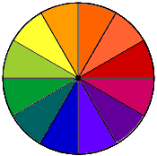
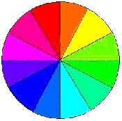
Color Wheels
Color wheels are circles divided into colors with natural progressions of those colors that indicate how they are formed by a prism. The first person to create a color wheel was 17th century scientist Sir Isaac Newton. He did this by breaking down white light into the colors of the prism and then joining the two ends of the color spectrum together into a circle. A century later, German author and scientist Johan Wolfgang von Goethe created a color wheel indicating the psychological effects of colors. Many other artists and scientists created color wheels, but the color wheels on which our current ones are based came mainly as a result of color theory as developed by 20th century Swiss color theorist and Bauhaus artist Johannes Itten. His color wheel was based on the three primary colors of Red, Yellow, and Blue (the RYB model).
Color Models
A color model is a system of naming and reproducing colors and is normally based on the optical properties of colors. The range of colors that can be produced in any particular color model is called the color gamut.
How color is created depends on what we are using to create it. With light, such as that on your computer screen, a mixture of the three primary colors of red, green, and blue combine together to make white light. This particular model is called the RGB model (Red, Green, Blue), and the basis for this model is the action of the cone cells in the human eye’s retina. The cones perceive color, and when all colors are mixed together in equal proportions the eye sees white. When no color or light is present, the eye perceives black. The problem with RGB color is that the color gamut is very limited.
There are other models related to the RGB model, but their colors are expressed differently in some way. There is the HSL model (Hue, Saturation, Lightness), the HSB (Hue, Saturation, Brightness), and the HIS (Hue, Saturation, Intensity). As you can see, the differences in these models are in the use of lightness and brightness/intensity.
With pigments (paint, ink, dye, etc.) color is treated differently than it is in the RGB and related models. As children, many of us were taught about colors by using the RYB model (Red, Yellow, Blue), in which red, yellow, and blue are the primary colors and by mixing them together we get the secondary colors. But RYB secondary colors tend to turn out a little murky, and so that system has been more or less abandoned by many color professionals. Today’s artists instead rely on the CMY or CMYK model in which the primary hues are Cyan, Magenta, and Yellow, which when combined together make a reasonable facsimile of black (the “K” in CMYK).
The CMY or CMYK model has a huge color gamut. It can produce an almost infinite number of colors. That is why it has been in widespread use by commercial printers running four-color (also called full-color or process color) presses, although they normally use a black ink, because mixing the CMY colors together results in a black that is not rich enough or black enough. Our desktop inkjet and laser printers also use the CMYK system of color mixing. There is also a six-color process printing model called Hexachrome, in which the CMYK model is expanded to include Hexachrome Orange and Hexachrome Green. The Hexachrome model can create the majority of the Pantone colors, as opposed to the CMYK model which can create only about half of them.
The French developed the CIE model, named after the organization Commission International de l’Eclairage, or the International Commission on Illumination. This group studies vision, color, light, radiation, photobiology, photochemistry, image technology, and interior and exterior environmental lighting and lighting design. It has discovered that the human eye’s receptors cause some colors to be associated with other colors. As a result, the CIE model includes all visible colors, regardless of whether they fit into the RGB or CMYK or any other models. Another model related to CIE is the UCS model (Uniform Color Space).
Many artists do not feel that any of these models are appropriate to their needs, and perhaps they are not. How you use color and the color models on which you base your palette are entirely your own choice.
Color Chips
If you are an artist or designer, or even if you recently visited a paint store, you are probably familiar with color chips, those samples of pre-mixed colors that have been assigned numbers and color names that correspond exactly to the formulas for mixing those colors. Most, if not all, of these chips are produced using the Pantone Matching System or the Pantone Process Color System, and while the original Pantone color system consisted of only 504 colors, it now specifies 3,000-plus colors. The Pantone color selection system is also available on most software programs such as Photoshop and QuarkXPress.
Mixing Colors
Most artists do not sit down and create color wheels once they have left school. They rely on visual instinct to guide them when they are mixing colors. But, it still helps to have the understanding of how colors wheels are made and how the colors in those wheels are created.
As mentioned previously, the colors used by most artists today are produced using the CMY model. This means that your three primary colors are cyan, magenta, and yellow. To create the secondary colors, you mix equal parts of each primary at 100% saturation, resulting in a warm red (toward the orange side), green, and purple.
Tertiary colors are produced by mixing one primary at 100% saturation with another primary color at 50% saturation, resulting in a cool red (towards the cyan or magenta side), orange, lime green, turquoise, purple-blue, and a mauve-violet. You can go even further and mix quaternary colors, which are produced by mixing one primary color at 100% saturation with another primary color at either 25% or 75% saturation, which results in cherry red, red, red-orange, orange-yellow, yellow-green, warm green, cool green, blue-green, blue, ultramarine blue, purple-mauve, and red-violet.
To produce your blacks and grays, you mix the complementary colors, those colors that are exactly opposite each other on a color wheel.
This article last updated: 03/17/2013.


